Native mobile controls in Jitterbit App Builder
Developers have the option to configure specific settings to control whether an App Builder app installed on a mobile device will use the native mobile UI or App Builder's UI to display specific Control types. This information can be configured both at an application level as well as at the individual Control level for List and Date Controls.
If you know that you always want the applicable Control types to use the mobile device native UI, then you should configure the appropriate values at the application level. If you want more granular control over this type of display, you can configure at the individual Control level.
Configure at the application level
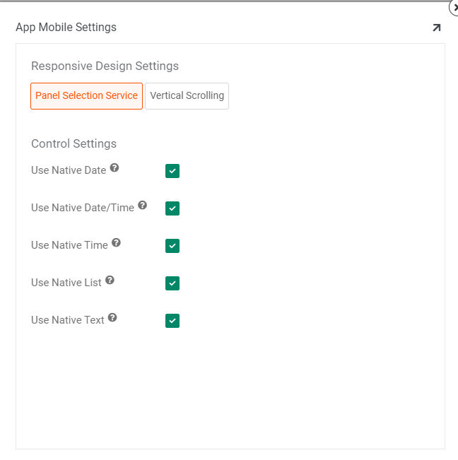
The following Application Mobile Settings reflect what the default UI display should be for mobile app users (when using the Application Default setting on the Control itself). By default the Control Settings options are not enabled.
To enable application mobile settings:
- Log in as a Developer user
- Locate your application from Site Menu
- Click the app pencil edit icon
- Click the More button from App Settings
- Select Edge Case
- Click the Mobile Settings button
Available control settings:
- Use Native Date - If enabled instructs to use the mobile device native UI display vs. App Builder for date
- Use Native Date/Time - If enabled instructs to use the mobile device native UI display vs. App Builder for date/time
- Use Native Time - If enabled instructs to use the mobile device native UI display vs. App Builder for time
- Use Native List - If enabled instructs to use the mobile device native UI display vs. App Builder for lists
- Use Native Text - If enabled instructs to use the mobile device native UI display vs. App Builder for text

Configure at the control level
If you are looking to have more granular control over whether available Controls render using the native mobile UI, you will want to configure this information at the Control level.
List and Date type Controls have an Edge Case Setting option that can be set for mobile.
To configure at the control level
- Navigate to the Live Designer for the panel with the Control you're looking to configure
- Select the Control from the page view
- Click the Edge Case tab
- Expand the Mobile Settings
-
Here you will find a Use Mobile Native Control field, with the following options that can be set for mobile:
- Application Default: If enabled, then always follow the Application setting under Mobile Settings (this value is the default).
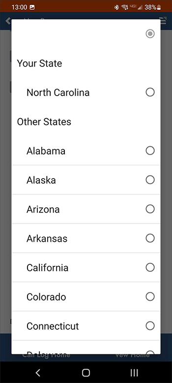
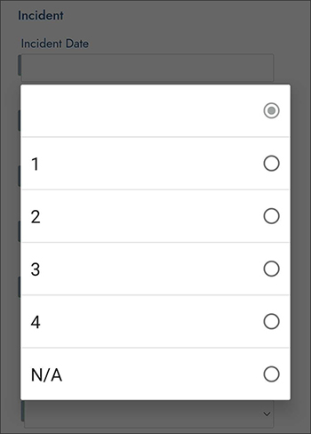
- Native: Uses the native controls on the mobile device such as scrollable popup lists. These lists respect group by titles, but do not display subtitles.
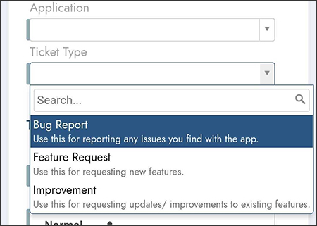
- App Builder: Forces the mobile device to render the App Builder version of the control, such as the drop down style of list box with subtitles.
Examples
Native examples
Group By for Native:

List with Native Selected:

App Builder example
List with Description Title and Subtitle displayed, App Builder Selected:
