Panel groups supported in scrolling panels in Jitterbit App Builder
Panel Groups are supported inside of Scrolling Panels, to provide greater UI/UX flexibility with how overflow information is presented to users on an application screen. You can create more robust and complex scrolling option layouts for panels on pages. You have an option to have overflow panels stack and allow users to scroll (vs. tab) to view all of the content.

Use case
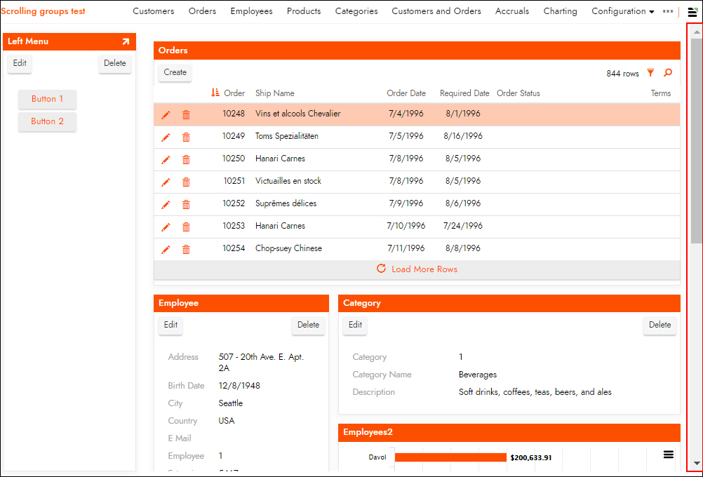
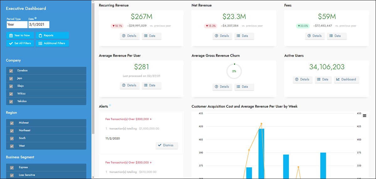
Currently scrolling pages and panel groups stack all contained panels vertically with a 100% width, which seems appropriate for a narrow mobile device. For a desktop or tablet device it would be nice to have contained panels also appear side by side. This would allow for the creation of more elaborate presentations with a lot of panels. Think of Facebook, Twitter, and Instagram. These platforms all have long scrolling collections of panels that combine stacked and side by side layouts. See the following screenshot as an example:

Overview
The behavior of defining panel groups within scrolling pages and groups will render the contained groups and panels as defined by the groups. You can mix and nest stacked and side by side panel groups as deeply as required to create the structure you need.
When the scrolling container encounters a child panel or stacked panel group it will expand to fill the width of the parent container. The height will be whatever is needed to fully render the content. This is how scrolling groups and pages work now.
When a scrolling container encounters a side by side child group it will render the side by side group as any other side by side group where the overall width of the group is defined by the parent layout. This is basically how non-scrolling layouts work. The height however will still be as tall as required to display the content like scrolling containers currently work.
If the outer page becomes too narrow, as on a phone, the side by side panels will start stacking vertically. This acts more like a current scrolling container today. So on a very narrow display you will end up with all panels and containers 100% wide and stacked vertically.
To configure
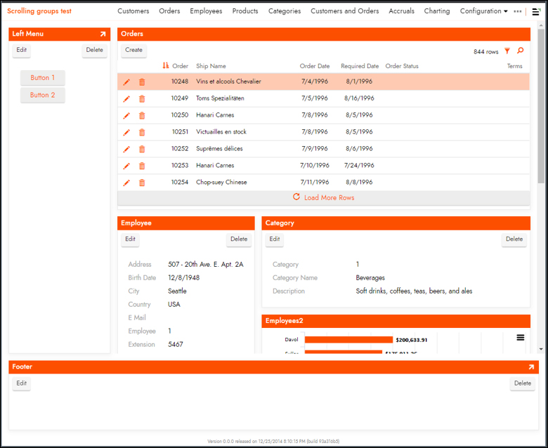
To support this new option, a scrolling page or group can now contain child groups. In this example scenario, we'll assume we are going to configure something like the following example where we have a fixed left panel, a fixed footer panel, and a scrolling group occupying the majority of the upper right of the page. This scrolling group contains a collection of nested child groups and panels to create a tall scrolling area of panels.

The following graphic shows the collection of Groups defined for this particular page:

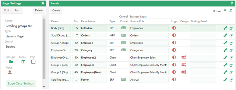
The following graphic shows the collection of Panels defined for this particular page:
