Component Palette
Overview
The component palettes are the collapsible panels on the right side of the Cloud Studio UI. Their contents are relevant to the design canvas or script editor, depending on which screen is open. To distinguish the contents of the palette, it is referred to as either the design component palette or the script component palette.
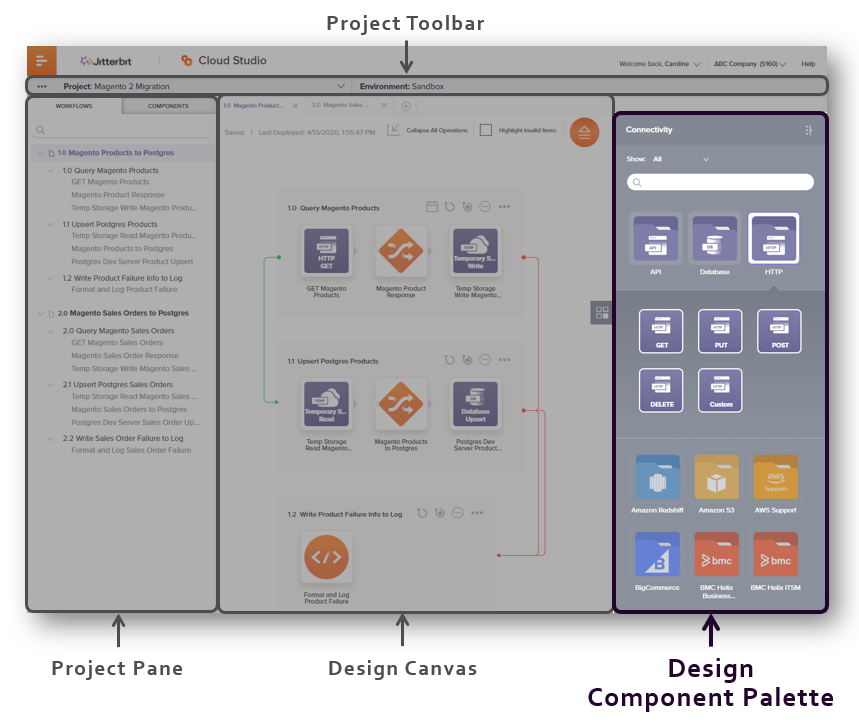
In an open project, the design component palette is displayed on the right of the project designer:
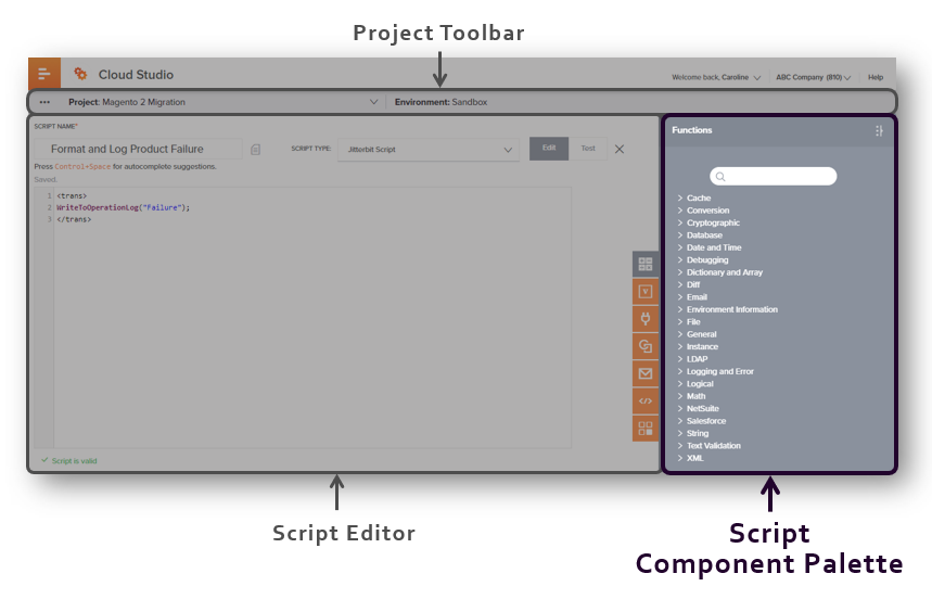
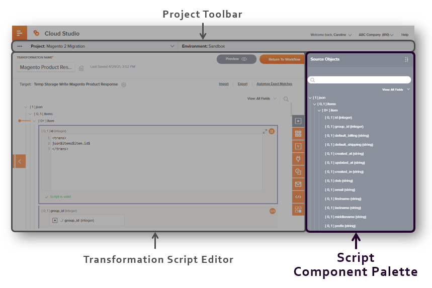
To access the script component palette, open a script or transformation in script mode. The script component palette is displayed on the right of the script editor:
The two types of component palettes are described on the pages included in this topic:
-
Design Component Palette
The design component palette provides access to create endpoints using connectors. -
Script Component Palette
The script component palette provides access to source objects, functions, variables, plugins, operations, notifications, scripts, and endpoints that can be used in a script.