Design canvas
Introduction
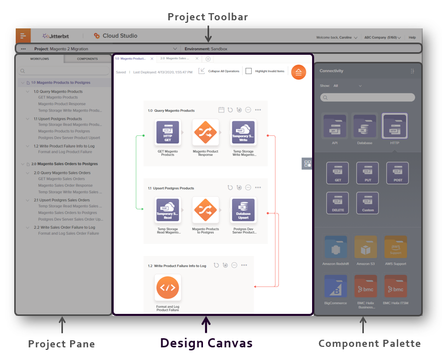
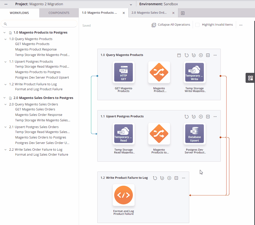
The design canvas is the central area when you open a project that serves as the primary workspace where you visually design integrations. This page covers elements of the user interface that are present on the design canvas, as well as key concepts to understand while working on the design canvas.
Note
The design canvas and design component palette have a beta version of a redesigned user interface (as shown in the sections below). The beta version is accessible by using the key combination Control+Shift+F3 (Windows) or Command+Shift+F3 (macOS). To provide feedback on the new design, contact your Customer Success Manager (CSM).
To access the design canvas, first open a project. In an open project, the design canvas is the central area located to the right of the project pane and to the left of the design component palette, below the project toolbar:
Design canvas header
These elements are present along the top of the design canvas:
-
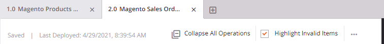
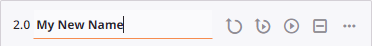
Workflow Tabs: Workflows are accessed from tabs along the top of the design canvas. Additional workflows can be created by clicking the new workflow icon. The new workflow opens in a new tab within the design canvas. Workflows are numbered sequentially in the order they are created, as 1.0, 2.0, 3.0, etc. If you reorder workflows, this numeric sequence adjusts accordingly (see Reorder workflows in Workflow creation and design).
-
Save Status: The auto-save status is displayed in the top left of the design canvas. These statuses are available:
- Saved: All project items are saved as currently configured.
- Saving: The project is currently being saved. This status occurs only after changes have been made.
-
Last Deployed: The date and time that any part of the project was last deployed is displayed. If no parts of the project have yet been deployed, nothing is displayed here.
-
Collapse All Operations or Expand All Operations: Toggles the display of all operations within the current workflow to a condensed or expanded view (see Expand or collapse operations in Operation creation and configuration).
-
Highlight Invalid Items: Toggles the display of invalid items (see Workflow validity, Operation validity, or Component validity, respectively).
-
Actions: Click the actions menu icon to open the design canvas actions menu (see Design canvas actions menu later on this page).
Design canvas elements
The primary function of the design canvas is to have a workspace where you visually design workflows. Each workflow is made up of a collection of operations that is used as a tool for your convenience to help segregate different parts of the project.
Workflows are designed by placing and configuring operations on the design canvas. Design canvas elements are the items that visually appear on the design canvas to help you design a workflow, including these:
- Drop zones for operations and for other components used as operation steps
- Operations and the components used as operation steps within them
- Notifications that are linked from operations
- Operation references that are outside of the current workflow and linked from an operation in the current workflow
- Lines that connect linked operations, scripts, and notifications
Each of those design canvas elements is covered below. For additional information on designing workflows, see Workflow creation and design.
Drop zones
A drop zone is a visual representation of where an operation or other component can be placed on the design canvas. There are two types of drop zones, operation drop zones and component drop zones:
-
Operation drop zone: Operation drop zones indicate where an operation can be placed. An operation drop zone is permanently displayed at the bottom of the design canvas after the last operation. To show additional operation drop zones, hover above the existing operations. When you click to select an operation drop zone, it is displayed with a purple border outlining the drop zone and is selected until you change focus:
-
Component drop zone: Component drop zones indicate where other components that can be used as operation steps can be placed in an existing operation. To show a component drop zone, hover to the left or right of an operation step in an existing operation on the design canvas. When you click to select a component drop zone, it is displayed with a purple border outlining the drop zone and is selected until you change focus:
An actions menu is available on each drop zone. Both operation drop zones and the drop zones for other components show the same menu items, as described in Drop zone actions menu later on this page.
Operations
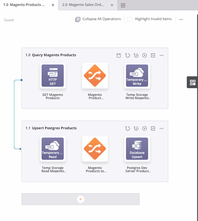
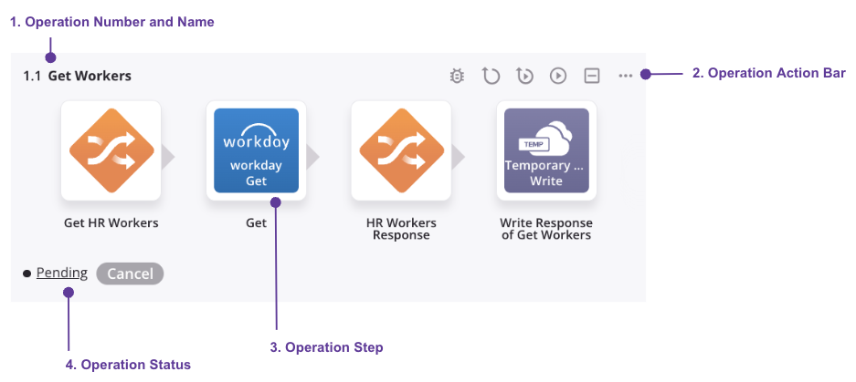
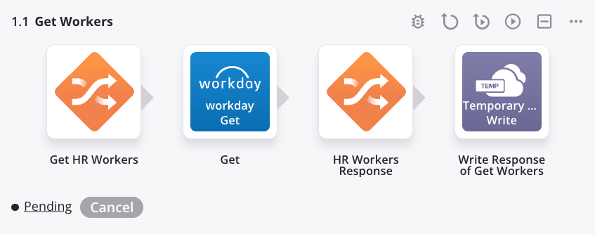
Operations are visually represented on the design canvas by a dynamic rectangular area with a gray background.
An operation consists of these elements:
Legend
① Operation name
② Operation action bar
③ Operation steps
④ Runtime status
⑤ Deploy status
Operation name
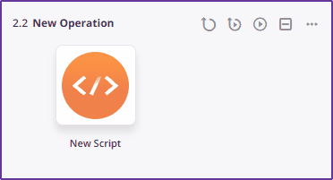
The top left section of an operation consists of the user-provided name of the operation. When you create a new operation, its default name is New Operation. Subsequent new operations with default names are appended with an incremented number in parentheses. Operation names must be unique and must not contain forward slashes (/) or colons (:) to be valid. To rename an operation, see Renaming workflows, operations, and operation steps later on this page.
Operation action bar
The operation action bar appears in the top right of an operation when hovering on the operation and consists of this set of icons:
| Icon | Description |
|---|---|
Collapses the operation into a smaller, condensed view (see Expanding or collapsing operations in Operation creation and configuration). This icon is displayed only when the operation is expanded. | |
Expands the operation into the standard view (see Expanding or collapsing operations in Operation creation and configuration). This icon is displayed only when the operation is collapsed. | |
Deploys the operation and its dependencies (see Deploying in Operation deployment and execution). | |
| Deploys and runs the operation and any downstream (linked) operations (see Operation deployment and execution). | |
| Runs an already-deployed operation and any downstream (linked) operations (see Operation deployment and execution). | |
Opens the operation settings on the Options tab, where you can configure the Enable Debug Logging Until setting (see Operation options).
| |
| Places a copy of the component on your clipboard and deletes the original component from the project (see Component reuse). | |
| Places a copy of the component on your clipboard (see Component reuse). | |
| Opens the operation actions menu, described later on this page. |
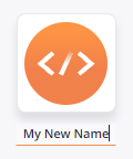
Operation steps
Each operation that has already been configured with operation steps includes a visual representation of those steps. Each step is represented by a square showing an icon representing the component, beneath which is the component name:
-
Actions bar: Each operation step has an actions bar that is accessible by hovering on the operation step. Each menu item is described in Component actions bar later on this page.
-
Plugin icon: Activities that have been configured with a plugin that runs on execution of the operation display a plugin icon in the top right of the operation step. For more information, see Plugins added to an activity.
-
Listener icon: Listener activities are shown with an icon that indicates the listener status. For more information, see the Listening service page.
-
A blue listener icon indicates listening is enabled for this activity.
-
A gray listener icon indicates listening is not enabled for this activity.
-
-
Events enabled / events disabled: After an operation that contains a listener activity is deployed, a toggle appears. The toggle can be used to enable or disable event listening for that operation. For more information, see the Listening service page.
Runtime status
Under certain circumstances, the lower section of an operation has the operation's runtime status and the option to cancel the operation:
-
Operation Status: After an operation has been successfully submitted to the operation queue, the real-time operation status is reported at the bottom of the operation. For details, see Operation status in Operation deployment and execution.
-
Cancel: Visible only when the operation status is Submitted, Received, Pending, or Running. Click to send a request to the agent to cancel the operation. Clicking Cancel sends a request to the agent to stop the operation and a Cancel Requested status is displayed next to the real-time operation status:
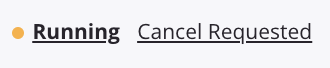
Note
Operations that have a Cancel Requested status may still run.
Deploy status
Each operation's deploy status is displayed on the lower section of each operation:
- Undeployed: Indicates that the operation has undeployed changes (see Deploying in Operation deployment and execution).
- Deployed: Indicates that the current version of the operation is deployed.
Select operations and operation steps
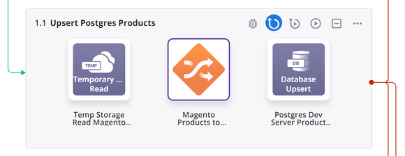
To select an operation, click the background of the operation. A selected operation is displayed with a purple border outlining the operation. In this example, the entire Get NetSuite Approved Orders operation has been selected:
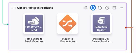
To select an operation step, click the visual representation of the step. A selected operation step is displayed with a purple border outlining the component. In this example, the Map NS Sales Orders transformation is selected:
Notifications
A visual representation of a notification appears automatically on the design canvas when you link an email notification using the Send Email Notification operation action. Additional information about the visual display of links is provided below under Lines.
The email notification is displayed with a gray background. Within the background area, the email notification is represented by a rectangle showing an icon, beneath which is the email notification name. To select an email notification, click the visual representation of it. A selected email notification is displayed with a purple border outlining the component:

For menu actions available on an email notification, see Component actions menu later on this page.
Operation references
Operations that exist outside of the current workflow can be referenced from an operation in the current workflow. When such an operation is linked, a visual representation of the outside operation automatically appears on the design canvas in the current workflow. Additional information about the visual display of links is provided below under Lines.
The operation reference is displayed with a gray background and contains shape icons that serve as a general representation of operation steps.
An operation that does not exist in another workflow is displayed with the name of the operation only:

An operation that exists in another workflow is displayed with the name of the workflow, followed by the operation name. Click the words to open the workflow in which the operation exists:

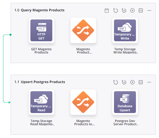
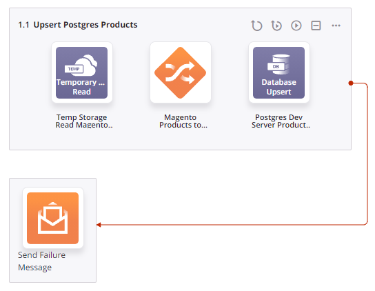
Lines
Lines that connect linked operations, scripts, and notifications automatically appear on the design canvas. The links can be created either using operation actions or using the RunOperation function.
The color and position of the lines indicate their meaning. Examples of these lines are provided following these descriptions:
- Green: Green lines are displayed for an On Success condition and appear on the left of linked operations or emails.
- Red: Red lines are displayed for an On Fail condition and appear on the right of linked operations or emails.
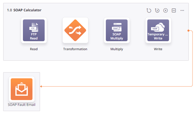
- Orange: Orange lines are displayed for an On SOAP Fault condition and appear on the right of linked operations or emails.
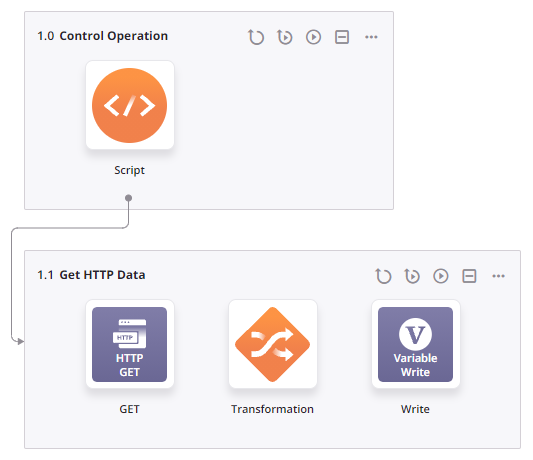
- Gray: Gray lines are displayed for an operation called from a script using the
RunOperationfunction.
On success condition
On fail condition
On SOAP fault condition
RunOperationFunction
Actions menus
Actions menus accessible from the design canvas include those for the design canvas, components, and drop zones.
Design canvas actions menu
Click the actions menu icon in the top right of the design canvas to open a menu with these actions:
| Menu Item | Description |
|---|---|
 | Undo reverses your last action (see Undo and redo in Cloud Studio permissions, collaboration, and saving). |
 | Redo reverses your last Undo action (see Undo and redo in Cloud Studio permissions, collaboration, and saving). |
| Deploy shows these menu actions:
|
 | Migrate opens the project migration screen, where you can choose the target environment (see Project migration). |
 | Project History opens a panel on the right side of the project designer where you can view project history events, tag events, and restore projects (see Project history). |
Component actions
To open an operation's actions menu, do one of these:
- Right-click anywhere on the operation action bar.
- Click the actions menu icon in the top right of an operation.
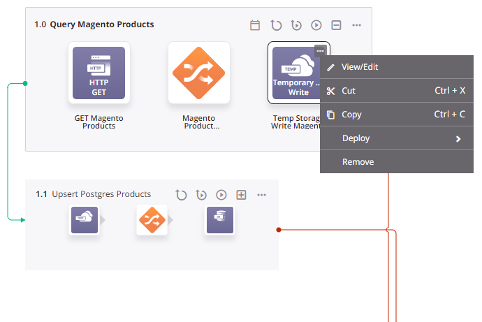
Hover on an operation step (activities, transformations, or scripts) and email notifications to view its actions bar.
Some actions are available only on certain types of components, as detailed in the subsections below:
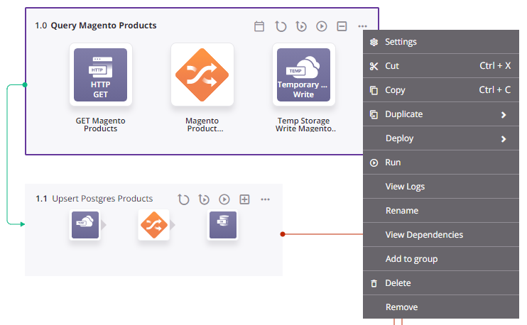
- Operations: The actions menu for operations (shown in the left image) has unique items such as Settings, Duplicate, Run, View Logs, Rename, View Dependencies, Add to Group, and Delete, and unique sub-menus for Deploy. It also includes common actions such as Cut, Copy, and Remove.
- Activities, scripts, transformations, and email notifications: The actions bar for these components share the same actions, including View/Edit, Cut, Copy, and Remove (shown in an activity's actions bar in the right image).
Operation actions menu
Activity action bar
Operations
These items are available in an operation's actions menu:
| Menu Item | Description |
|---|---|
 | Settings opens the operation settings, containing three tabs:
|
 | Publish as an API opens a dialog to configure and publish an API Manager custom API to be used to expose the operation for consumption (see Publish as an API). The number of APIs the operation is assigned to is displayed next to this menu item. This action is visible only when the operation has no undeployed changes. |
| Duplicate shows these menu actions (see Operation reuse):
|
| Deploy shows these menu actions:
|
 | Run runs an already-deployed operation and any downstream (linked) operations (see Operation deployment and execution). |
 | View Logs opens the operation log screen, which includes logs for this operation and any child operations that have been deployed and executed (see Operation logs). |
 | Rename positions the cursor on the operation name for you to make any edits as necessary. |
 | View Dependencies changes the view in the project pane to display any other parts of the project that the specific operation is dependent on (see Operation dependencies, deletion, and removal). |
 | Add to Group opens a dialog to create a new custom group or to add the component to an existing group (see Component groups). |
 | Delete permanently deletes the component (see Operation dependencies, deletion, and removal). |
 | Remove removes the operation from the design canvas. Any other references to the operation, such as within scripts, transformations, or configuration settings, are unaffected (see Operation dependencies, deletion, and removal). |
Activities, scripts, transformations, and email notifications
The actions bar for these components share the same actions:
| Icon | Description |
|---|---|
| Edit opens the configuration screen for the component. For details on configuration, refer to the respective component under Connectors, Scripts, or Transformations. | |
| Cut places a copy of the component on your clipboard and deletes the original component from the project (see Component reuse). | |
| Copy places a copy of the component on your clipboard (see Component reuse). | |
| Remove removes the component as an operation step from the operation. Any other references to the component, such as within scripts, transformations, or configuration settings, are unaffected (see Component dependencies, deletion, and removal). |
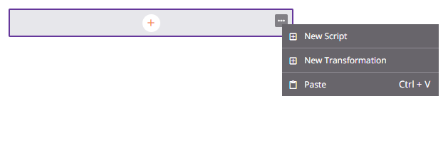
Drop zone actions menu
Operation drop zones are always visible on the design canvas. To show the drop zone for a component that can be used as an operation step, hover to the left or right of an operation step in an existing operation on the design canvas.
To open the actions menu for either type of drop zone, do one of these:
- Right-click the drop zone.
- Hover over the drop zone, and then click the actions menu icon.
Both operation drop zones and the drop zones for other components show the same menu items:
Operation drop zone actions menu
Component drop zone actions menu

| Menu Item | Description |
|---|---|
 | New Script creates a new script as a step in a new or existing operation (see Script types and creation). When used on an operation drop zone, a new operation is also created. |
 | New Transformation creates a new transformation as a step in a new or existing operation (see Transformation creation and configuration). When used on an operation drop zone, a new operation is also created. |
 | Paste creates a duplicate of an activity, script, operation, or email notification that is on your clipboard as a new component referenced by a new or existing operation (see Component reuse). When used on an operation drop zone, a new operation is also created. The default name of the new component uses the name of the original component appended with - Copy. Subsequent duplicates are further appended with an incremented number in parentheses. |
Rename workflows, operations, and operation steps
To rename a workflow from the design canvas, double-click the name in the workflow tab along the top of the design canvas:

To rename an operation from the design canvas, click the name in the operation:
To rename steps within an operation from the design canvas, click the name in the operation:
Reorder operations
Operations in the same workflow can be reordered by dragging and dropping them on the design canvas.
Click and hold anywhere on an operation to pick it up and drag it above or below other operations within the workflow:
This action has a cascading effect of renumbering the operations above or below it in the project tree.