Dynamically Changing an Icon
Icon's are typically static and unchanging, but sometimes you will need to show a different icon based on data. For example, on a page that shows the people who have been invited to an event, you could show an icon of a thumbs down or a thumbs up to denote if they are attending or not. Below are examples of how you can implement a dynamic icon in your app.
For the purpose of this document, we refer to named icons using the Font Awesome library of icons. Vinyl ships with Font Awesome. To see a list of the named icons available see fontawesome.com.
Icon Control
The Icon control type allows you to pass the CSS name of an icon (such as times-circle-o) through, and it searches for it in the icon library to display. It is not possible to add to the icon library.
If you only have 1 or 2 icons, you can likely insert an IIF statement into your Business Object, and allow that to determine which icon to display. For example, if you want to denote attendance for an event, you would have something such as IIF(Status = Accept, 'thumbs-up', 'thumbs-down'). This scenario works well when you have only a couple options to choose from, but will get complicated as you need to accommodate for more options. For our example, you may also want to show a question mark icon if the person has yet to accept or decline their invitation.
In the case above you will either need to make a larger and more complicated IIF statement to accomodate the third state, or you can alter your data model to include a column that stores the icon. The below steps will walk you through the case where you alter your data model.
- To continue with the example above, you will need to create a
Statustable with columns forStatusID,Status, andIcon. - Be sure to input information including the icon titles into the
Statustable for each Status. For example: Yes, No, Maybe - Next create a Business Object that joins to the
Statustable. Ours is called Employee (Status). We will bring in theIconcolumn from theStatustable for use. - To use this information in your app, make sure your panel is built on the object just created. Create a control called Status as a List Control Type using Status (List)'s
StatusIDandStatusto display the options.
Using a column is almost always superior to an IIF statement, because an IIF statement will require you to impliment new logic when you have a new state to account for, but if you have a column on a status table, you will be able to allow a user to configure the icons used.
Image Relative URL GUID
The IIF statement used to instruct what Icon to display can reference the image Relative URL GUID. To obtain the image GUID value, view the Image in Vinyl and copy the value from the Relative URL field that appears after .../image/. This value can now be used in the IIF statement accordingly.
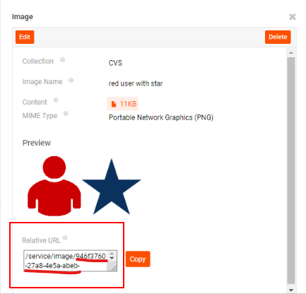
Example of an image Relative URL GUID
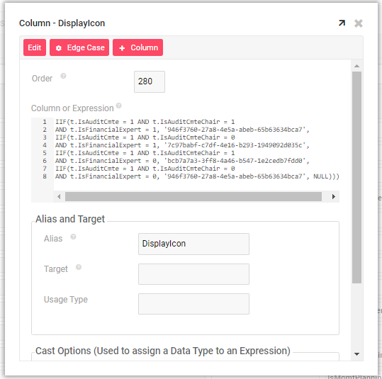
Example IIF statement referencing image Relative URL GUID
List Control
The List control is typically used to display a list of text values, but it can also display an image along with the text, or just the image itself. When setting up the List control, you simply need to go to Additional Attributes and select the column that stores your ImageID as the Icon value. Using the Image Purpose of 'Icon' will effectively allow you to have dynamic icons. Since a developer can add to the Image library of an application, this method for a dynamic 'icon' is a bit more robust than using the Icon control.
To make use of a List Control for dynamic icons, you need to have a column to store your ImageID on the table that supplies the List values. This way, you can tie each of the list values to a particular image in your App's Collection. In the same way you pull a Title value out of a list object to display it as text on the list, you will also pull an ImageID out of the list object to display that image alongside the text.