Style Themes
About
This guide describes the current implementation of Styles (or: Themes)
Overview
Vinyl allows the creation of themes. Themes are pairings of Interfaces and Value Types.
An interface represents a place in the user interface that can have its properties changed. Value Types are properties that can be changed.
For example,
Set the Font color [Value type] of the* Selected Data Grid Row* [Interface] to blue.
Theme-less state
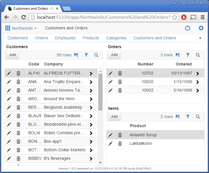
Vinyl without any themes defined at the app level looks like Fig 1:

Fig 1: Un-themed state of Vinyl
Interfaces
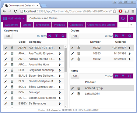
Creating a new theme and assigning it to the application will not result in any changes, since the new theme has no Implementations. The colors chosen at the theme level do not automatically apply to any parts of the user interface. Fig 2 has the Background color set to purple for Links.
Interfaces are parts of the UI that can receive style implementations.

Fig 2: Link interfaces highlighted

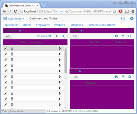
Fig 3: Panel containers highlighted (screenshot taken mid-load to show the area of the container)

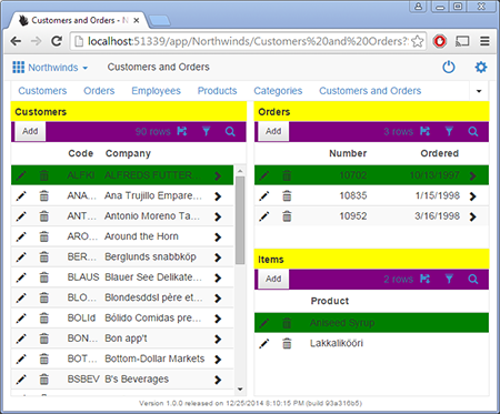
Fig 4: Panel headers are yellow, Toolbars are purple and Selected Data Grid Rows are green in this screenshot.
Value Types
With a interface specified, you can select a value type to apply a property. These can be font colors, background colors and images.
On the theme page, each type has a Help text window in the bottom right. These contain helpful links and instructions to know what to provide.
Referencing colors by reserved syntax
If specifying colors (border color, background etc) you can type the name of one of the three colors defined at the theme level. This allows faster customization when using the Copy feature.
The reserved syntax terms are:
- {PrimaryColor}
- {SecondaryColor}
- {ComplementaryColor}
Adjusting colors
When using reserved names, colors can be adjusted as well.
Syntax:
{PrimaryColor|15}
Adding |15 (pipe character) increases the brightness of a color by 15%, |-15 decreases the color. This allows for themes to say, Use primary color, and set the border to be a slightly darker version of that color.
Copy button
Each theme can be copied. Use this feature if you want to quickly get up and running with a theme and just set the three colors.
Orange is a complete theme with most of the page elements styled. High contrast works well also, but it styles the main background color and also affects the font color across the site.
Vinyl provided themes
Vinyl ships with several themes. Although these are technically editable, when you upgrade any changes will be lost.
Note
Copy a theme if you wish to keep your changes during an upgrade.
Suggestions
If you specify a dark background color, ensure you use a font color that is readable. Take advantage of the text-shadow property included in font color to add extra contrast.
Appendix
Interfaces
| Real Estate Area | Interface Name | Description |
|---|---|---|
| Page | Container | The overall site body, modal windows, other pop-ups |
| Tab - Active | Active tabs on a page | |
| Tab - Inactive | The row in datagrids that is currently highlighted. | |
| Misc content areas | Various panels such as the action drawer and date picker boxes | |
| Page bar | Links | Links in the top Page Bar |
| Container | The top bar containing the page name, navigation and the "more" button | |
| Splitters | Tiny splitters between elements | |
| Drop down menus | The drop down menu, opened with menu items | |
| Drop down menu items | The drop down menu items | |
| Service Status - OK | The triangle icon used to indicate the service is running. | |
| Service Status - Problem | The triangle icon used to indicate the service is not running. | |
| Service Status - Unknown | The triangle icon used to indicate the service is in an unknown state. | |
| Service Status - Gap area | Specify the border right color to control the small element that leaves a gap next to the triangle. | |
| Container Page Title | The containing element in the top bar for the page title alone. | |
| Panel | Header | The area above a panel, contains the panel name |
| Activity indicator | Animated circle indicating panel network activity | |
| Container | Panel holding the header and panel contents | |
| Contents | Panel content container | |
| Panel disabled | Panels that are disabled because they have incomplete bindings | |
| Toolbar | Toolbar | Toolbar containing buttons and panel level controls |
| Single-row Panel | Control set | Fieldset container holding form controls |
| Control set - Title | The legend part of the fieldset container | |
| Form labels | The title representing the field on a form | |
| Board and Lane Panels | Tile | The containing tile element of a tiled panel type |
| Tile - Active | The containing tile element of a tiled panel type, when active | |
| Link to Page icon | The icon that links to a page | |
| Multi-row Panel | Selected Row | The row in datagrids that is currently highlighted. |
| Headers | Columns headers on a data grid | |
| Rows - Odd | Every odd row in a data grid | |
| Rows - Even | Every even row in a data grid | |
| Rows - Total | The total row of a data grid | |
| Cells | Cells in a multi row panel | |
| Rows - Add Row | The add row that appears when inserting on a multi-row panel | |
| Grouped by values | Cell values that are dithered when using group by | |
| Pop-up | Close Button | The X button that closes the modal panels |
| Overlay panel container | Panels that appear as an overlay | |
| Overlay container | Overlayed page container | |
| Action Drawer | Drawer items | Action drawer buttons |
| Home link | The Home link that goes to the site's Home page | |
| Controls | Links | Links across the application |
| Button | Buttons on a panel | |
| Highlighted | Various highlighted data items such as lists or days on a date panel | |
| Form element - Active | Form elements on the page | |
| Button animated | The spinning icon used to indicate activity | |
| Field values | All non-editable text values coming from a data source. | |
| Auto edit effect | The hover effect over top of an auto-edit field | |
| Icon fields | Icon field control types | |
| Always edit effect | The hover effect over top of an always editable field | |
| Badge | The badge element that attaches itself to other controls | |
| Links - Chevron | The chevron that appears after a hyper link | |
| Required field | The small color element that indicates a field is required | |
| Line control | Line controls, used to divide content on a panel | |
| Progress bar | Progress bar element | |
| Form Element | (null) | |
| Charting | Series 1 | The first series in a chart |
| Series 2 | The second series in a chart | |
| Series 3 | The third series in a chart | |
| Series 4 | The fourth series in a chart | |
| Series 5 | The fifth series in a chart | |
| Series 6 | The sixth series in a chart | |
| Highlighted | The highlighted chart color | |
| Flags | The flags on a chart | |
| Templates | CenteredPanel | Vinyl template, targetting the centered element in the middle of the panel. |
| CenteredPanel Logo | Vinyl template, the image stripe in the centered element. | |
| Calendar Panel | Day Boxes | The days in a calendar |
| Event | The event box inside a calendar | |
| Selected Event | The highlighted event box inside a calendar | |
| Today's Date - Box | The entire box of today's date | |
| Today's Date - Number | The number part of today's date |
Value types
| Value Type Name | Input Description | Help Text |
|---|---|---|
| 1 Background Gradient | A color fade from one color value to another | Value1 and 2 are used for the To and From colors. Value3 is for the border color. |
| 2 Background Color | Color code or named value used to fill the whole element | Value1 is used for the background color. Can be an html code or use {PrimaryColor} for example to use the Theme's color. |
| 3 Background Image | Url or Base64 image value | Value1 is either a url or a base64 encoded image. Right click on any Vinyl image and Copy URL to use Vinyl hosted images. Value2 is used to either stretch the image or repeat it. To stretch enter 'cover', otherwise leave it blank to repeat (tile) the image. |
| 4 Border Color | Color code or named value | Value1 is used for the border color. |
| 5 Icon - Glyph | Glyphicon code, not named value | Value1 is used for the Glyphicon code. |
| 6 Font color | Color code or named value | Value1 is used for the font color. Value2 needs to be in a specific format: 0 1px 1px #222. Change the color code to affect the actual color. |
| 7 Advanced Styles | Set more advanced CSS values | Value1 hides elements by setting the value to 'none'. Value2 sets the margin of the element, while Value3 sets the padding. |
| 8 Background advanced | All background related options | Value1 represents the background shortform. With this you can specify all the background choices at once. Value2 is the background size property. |
| 9 Box Shadow | Shadow effect on boxes | Value1 represents the box shadow values, while Value2 is used for the color of the shadow. |
| 10 Font Advanced | Setting various font styles such as type, size and boldness | Value1 is used for the font names. Use a comma separated list. Value2 is font size. This can be any unit of measure. Value3 is the boldness. You can enter in a value or use 'bold' or other reserved words. |
| 11 Border Radius | The curve of a border. Use 100% to create a circle. | Value1 is used to round the corners of an element. |
| 12 Flex box tile | Setting styles that affect Board panel tiles. | Values 1 and 2 control the size of tiles. |
| 13 Text advanced | Modifications to text | Value1 sets text-decoration, used to add underline and other properties. Value2 sets text-transform, used to uppercase text. Value3 sets font-style, used for italics. |