About style themes
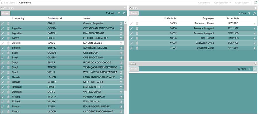
Themes have a Preview function, where you can get a quick visual representation of exactly how different screens and Panels in Vinyl will look with the selected Theme applied. This guide describes the current implementation of Themes.
If you are running Vinyl 2.2 or earlier, please refer to this Style themes article.
Note
Copy a Theme if you wish to keep your changes during an upgrade. If you're using a Theme for Page or Panel purposes, leave the Base Theme blank. Setting it to the App theme will load the app Theme CSS twice.
Overview
Vinyl allows the customization of how an app visually appears in the Application Layer through leveraging Style Themes. In Vinyl, Themes are defined pairings of Components and Value Types which allow you to control the appearance of defined areas of the Application Layer UI and UX. A Component here represents an area in the Application Layer UI that can have its properties changed, for example Page is a Component. Value Types represent the specific properties that can be changed or defined, for example Background color is a Value Type.
For example: Set the Background color [Value type] of the Links [Interface] to be purple.
Several predefined Base Themes are shipped with Vinyl which can easily be used by your application as is, or leveraged as a Base Theme which you can further customize. As well, the following options are available through Themes:
- Theme setting types are available to configure Alignment, Spacing, and CSS Transitions
- The following new areas of Pages from Vinyl are exposed to be customized via Themes:
- Chart, Map and Calendar Real Estate areas
- Tile margin on Boards/Lanes, Tile centering in a Panel
- Multi-row Panel Control Sets, headers and cells (allowing larger MRP rows)
- Validations (Errors, warnings, prompts and exceptions presented to the user)
- Back button
- Load more rows button
- Ability to Hide Toolbar if all intrinsic controls are hidden, including disabling count
- Close button ('x') is now part of the Panel and can be styled similarly
- Support panel visibility that hides the Panel but reserves the space (value of "3")
- Can now hide Panel Headers, or adjust their size via Formats
- Site level fonts can be loaded remotely
Theme-less state
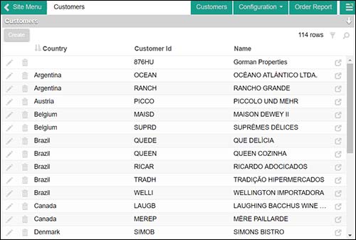
Without any Theme information defined and applied, Vinyl at the Application Layer level appears in a theme-less state with minimal stylization. With the use of Themes, a designer can quickly improve the overall look and feel of an app.
Interfaces
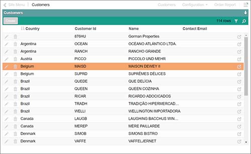
Creating a brand new Theme and assigning it to an application will not result in any visible changes, since the new Theme has no Implementations. The colors chosen at a Theme level do not automatically apply to any parts of the Application Layer User Interface. In order to see custom colors through the Application Layer you need to configure Component Settings. Fig 2 has the Page - Title Bar Component Background Color set to purple for the Links Area.
Components are parts of the UI that can receive style implementations.


Value types
With a Component specified, you can select a Value Type to apply a property. Value Types can refer to font colors, background colors, images, alignment, gradient information, size information, etc. depending on what specific Real Estate area you have selected to customize. On the theme page, each Value Type has corresponding Help text information which contains helpful tips and instructions on what specific information to provide.
Referencing colors by reserved syntax
When specifying colors in the Themes area of Vinyl, (border color, background color, etc.) you can reference the name of one of the three colors defined at the Theme level. This allows faster customization when using the Copy feature.
The reserved syntax terms you can specify are:
{PrimaryColor}{SecondaryColor}{ComplementaryColor}
Adjusting colors
When using reserved names, colors can be adjusted as well for brightness or darkness and opacity.
Colors can be adjusted for brightness or darkness and opacity. This customization is available for the following reserved terms:
{PrimaryColor}{SecondaryColor}{ComplementaryColor}
To adjust color brightness and darkness, add a pipe character along with numeric decimal value (positive value to increase or negative value to darken the color). Expected values are -.9 - .9.
Syntax: {PrimaryColor|.25} or {PrimaryColor|-.25}
To adjust color opacity add the tilde character along with a numeric decimal value. Expected values are .1 - .9.
Syntax: {PrimaryColor~.25}
Copy button
Any Theme can be copied. Use this feature if you want to quickly get up and running with a Theme and just set the three colors for Primary, Secondary and Complementary. There are many predefined Themes available that can be selected and used as is or customized further to get up and running quickly.
Vinyl predefined themes
Vinyl ships with several predefined Themes. Although these are technically editable, when you upgrade any changes will be lost.
Suggestions
If you specify a dark Background Color, ensure you use a Font Color that is readable for all text. Take advantage of the text-shadow property included in Font Color to add extra contrast.
Appendix
Components
| Real Estate Area | Interface Name | Description |
|---|---|---|
| Page | Container - Page | The container for the Pages |
| Container - Site | The overall site body, modal windows, other pop-ups | |
| Tab - Active | Active tabs on a page | |
| Tab - Inactive | Inactive tabs on a page | |
| Tabs Container | The container for the tabs that appear in reduced viewports | |
| Page - Title Bar | Links | Links in the top Page Bar |
| Drop down menus - Container | The drop down menu items | |
| Drop down menus - Menu Items | The drop down menu, open with menu items | |
| Title Bar - Back Button | The back button that navigates to the previous page | |
| Title Bar - Container | The top bar containing the page name, navigation and the "more" button | |
| Title Bar - Page Title | The containing element in the top bar for the page title alone | |
| Title Bar - Splitters | Tiny splitters between elements | |
| Page - Action Drawer | Drawer items | Action drawer buttons |
| Site Menu | The Home link that goes to the site's Home page | |
| Service Status - Offline | The triangle icon used to indicate the service is not running | |
| Service Status - Online | The triangle icon used to indicate the service is running | |
| Service Status - Unknown | The triangle icon used to indicate the service is in an unknown state | |
| Page Pop-up | Close Button | The X button that closes the modal panels |
| Container | Overlayed page container | |
| Container - Panel Container | Panels that appear as an overlay | |
| Panel | Activity Indicator | Animated circle indicating panel network activity |
| Panel - Container | Panel holding the header and panel contents | |
| Panel - Content | Panel content container | |
| Panel - Disabled | Panels that are disabled because they have incomplete bindings | |
| Panel - Panel Container | The outer container of each panel | |
| Panel - Title Bar | The area above a panel, contains the panel name | |
| Panel - Toolbar | Toolbar | Toolbar containing buttons and panel level controls |
| Panel - Single-row Panel | Control Set - Container | Fieldset container holding form controls |
| Control set - Label | The legend part of the fieldset container | |
| Control set - Panel Content | The content container with a single row panel | |
| Field - Label | The title representing the field on a form | |
| Field - Value | The display state value of the field on a form | |
| Panel - Board and Lane | Link to Page icon | The icon that links to a page |
| Tile - Container | The containing tile element of a tiled panel type | |
| Tile - Filler | A filler element used to ensure wrapped boards align to the left. Hide this to center, along with justify-content: center | |
| Tile - Lane Title | The heading above lanes or groups of tiles | |
| Tile - Selected | The containing tile element of a tiled panel type, when active | |
| Tile - Tile Panel Container | An extra container wrapping all the tiles | |
| Panel - Multi-row | Field - Grouped On | Cell values that are dithered when using group by |
| Header - Container | Column header row on a data grid | |
| Header - Control Set | Grouped columns on a data grid | |
| Header - Control Set Label | The label above each control set group | |
| Header - Label | Each column header cell on a data grid | |
| Row - Add | The add row that appears when inserting on a multi-row panel | |
| Row - Cells | Cells in a multi-row panel | |
| Row - Even | Every even row in a data grid | |
| Row - Load more rows button | The button that appears when you can load more rows | |
| Row - Odd | Every odd row in a data grid | |
| Row - Selected | The row in data grid that is currently selected | |
| Row - Total | The total row of a data grid | |
| Panel - Chart | Chart Colors - Color 1 | The first series in a chart |
| Chart Colors - Color 2 | The second series in a chart | |
| Chart Colors - Color 3 | The third series in a chart | |
| Chart Colors - Color 4 | The fourth series in a chart | |
| Chart Colors - Color 5 | The fifth series in a chart | |
| Chart Colors - Color 6 | The sixth series in a chart | |
| Chart Colors - Text Color | The text rendered for various parts of a chart | |
| Misc - Flags | The flags on a chart | |
| Misc - Selected | The highlighted chart color | |
| Panel - Calendar | Container | The days in a calendar |
| Event - Container | The event box inside a calendar | |
| Event - Selected | The highlighted event box inside a calendar | |
| Today's Date - Container | The entire box of today's date | |
| Today's Date - Day | The number part of today's date | |
| Today's Date - Selected | The selected day of the month | |
| Controls | Badge | The badge element that attaches itself to other controls |
| Icon fields | Icon field control types | |
| Line control | Line controls, used to divide content on a panel | |
| Progress bar | Progress bar element | |
| Button - Activity Indicator | The spinning icon used to indicate activity | |
| Button - Container | Buttons on a panel | |
| Fields - Additional Field Containers | Additional form field content, such as list box options. | |
| Fields - Always Editable | The hover effect over top of an always editable field | |
| Fields - Auto Edit | The hover effect over top of an auto-edit field | |
| Fields - Edit State | Form elements on the page | |
| Fields - Edit State in use | Form elements on the page, when in focus or otherwise active | |
| Fields - Form Control | Form control | |
| Fields - Non Editable | All non editable text values coming from a data source | |
| Fields - Required | The small color element that indicates a field is required | |
| Fields - Selected | Various highlighted data items such as lists or days on a date panel | |
| Links - Chevron | The chevron that appears after a hyper link | |
| Links - Container | Links across the application | |
| Validations | Confirmation | Confirmation prompts for event such as Delete |
| Error | Validation results of type error | |
| Exception | Vinyl Exceptions that appear at the bottom of the screen | |
| Information | Validation results of type Information | |
| Warning | Validation results of type Warning |
Value types
| Value Type Name | Input Description | Help Text |
|---|---|---|
| 1 Background Gradient | A color fade from one color value to another | Value1 and 2 are used for the To and From colors. Value3 is for the border color. |
| 2 Background Color | Color code or named value used to fill the whole element | Value1 is used for the background color. Can be an HTML code or use {PrimaryColor} for example to use the Theme's color. |
| 3 Background Image | Url or Base64 image value | Value1 is either a url or a base64 encoded image. Right click on any Vinyl image and Copy URL to use Vinyl hosted images. Value2 is used to either stretch the image or repeat it. To stretch enter 'cover', otherwise leave it blank to repeat (tile) the image. |
| 4 Border Color | Color code or named value | Value1 is used for the border color. |
| 5 Icon - Glyph | Glyphicon code, not named value | Value1 is used for the Glyphicon code. |
| 6 Font color | Color code or named value | Value1 is used for the font color. Value2 needs to be in a specific format: 0 1px 1px #222. Change the color code to affect the actual color. |
| 7 Advanced Styles | Set more advanced CSS values for Display, Opactity and Transition properties | Value1 hides elements by setting the value to 'none'. Value2 sets the margin of the element, while Value3 sets the padding. Opacity is used to specify the opacity or transparency of an element. Expected values are 0.1 - 0.9. For example: 0.5 |
| 8 Background advanced | All background related options | Value1 represents the background shortform. With this you can specify all the background choices at once. Value2 is the background size property. |
| 9 Box Shadow | Shadow effect on boxes | Value1 represents the box shadow values, while Value2 is used for the color of the shadow. |
| 10 Font Advanced | Setting various font styles such as type, size and boldness | Value1 is used for the font names. Use a comma separated list. Value2 is font size. This can be any unit of measure. Value3 is the boldness. You can enter in a value or use 'bold' or other reserved words. |
| 11 Border Radius | The curve of a border. Use 100% to create a circle. | Value1 is used to round the corners of an element. |
| 12 Flex box tile | Setting styles that affect Board panel tiles. | Values 1 and 2 control the size of tiles. |
| 13 Text advanced | Modifications to text | Value1 sets text-decoration, used to add underline and other properties. Value2 sets text-transform, used to uppercase text. Value3 sets font-style, used for italics. |
| 14 Alignment | Set the alignment for different elements in a specified area | Value1 sets specifies the vertical alignment of an inline container, for example: middle. Value2 is used to set the horizontal alignment of text, for example: center. |
| 15 Font | Set various font style information, such as font type, size and how thick or thin (boldness) characters should be displayed | Value 1 is used to specify the font type for an element. Use a comma separated list. For example: Calibri, Arial, sans-serif. Value 2 is used to set Font size. Font size options range from xx-small to xx-large. For example: small. Value 3 is used to set Font weight, or how thick or thin font characters appear on the page. Font weight options range from normal to bolder. A Font weight of 400 is the same as normal, 700 is the same as bold. For example: bold. |
| 16 Spacing | Specify spacing values for content appearing in a container | Value1 sets Line Height. Line height property specifies the height of an element. Negative values are not allowed. For example: 1.4em. Value2 is used to set Margin. Margin property is used to create space around elements. Negative values are not allowed. 4 sides of an element can have Margin defined: top, right, bottom, left. Value 3 is used to set Padding. Padding property is used to generate space around an element's content. 4 sides of an element can have Padding defined: top, right, bottom, left. |