Button Control
Button controls allow you to place a control on a panel that appears like a button, and offer configuration options to control placement location, behavior on click (if desired), color, label, and more.
If additional control is desired over the look and feel of a Button, Vinyl supports this through Styles.
How To Configure a Button Control
- From the app view, go to Action Drawer > Live Designer
- If the Button should be associated with an underlying Column, select the value
- Set the Control Type to Button
- Assign a Name. This value will appear on the Button itself.
-
Select Control Subtype value to define if Button should be Primary or Secondary in appearance.
- Primary = appears as a main button on panel
- Seondary = appears as a secondary button on panel, lighter than a primary button
-
Click Next
- If the Button should Execute an Event on click, select the appropriate event
- If the Button should Link to Page on click, select the appropriate page
- Click Next
- Review the updates Vinyl will make when adding the Button control and click Finish
-
If a different Location is desired for the Button placement, select the appropriate value
- Body = default behavior which typically displays inline on the Panel
- Header = displays in the header region of the Panel, defaults to the right-hand region of the panel
- Panel (Menu) = displays in a nested menu that displays on Panel, top right region of Panel
- Toolbar = displays in the toolbar region of the Panel, defaults to the right of any existing Update Method buttons (e.g., Create, Audit)
-
Review the available options and make any further configuration updates
- Click Save
How to Style a Button
Styles can be used to further customize a Button control. Use the available Styles to change things like Button size, color, and font weight. You can customize a Style if further granularity is needed.
- Navigate to the app page with the Button control
- Go to Action Drawer > Live Designer
- Select the Button control from the page view
- From the edit region, go to More... > Styles
- Click + Style
- Select Buttons from Style Categories
- Locate the desired Style and click the corresponding + Add button. For example: Vinyl - Button Large Type
- Exit out of the Styles and edit screens, refresh the browser and confirm updates
Button Location Options
Button controls can be configured to be placed in 4 different areas on a panel using the Location field. Placement is defined by the Location option selected in the control edit mode. Areas Buttons can be placed on Panels include:
- Body = default behavior which typically displays inline on the Panel
- Header = displays in the header region of the Panel, defaults to the right-hand region of the panel
- Panel (Menu) = displays in a nested menu that displays on Panel, top right region of Panel
- Toolbar = displays in the toolbar region of the Panel, defaults to the right of any existing Update Method buttons (e.g., Create, Audit)
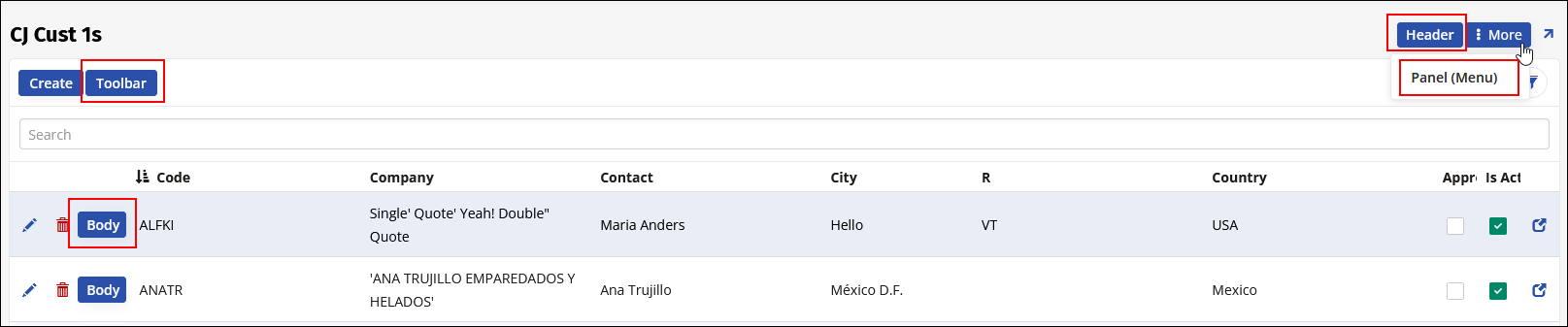
Illustration of different Button Locations available in Vinyl