Group Collapse/Expand, Accordion, Tabs
Vinyl supports the ability to configure Groups to collapse and expand when the title of the Group is clicked. Accordion and Tab are two types of Groups that can have information reside inside them, and are useful for presenting logical groupings of information. By default, Vinyl will present the first Control as expanded (or open), and the rest as collapsed (or closed).
You can customize the image being displayed on the Accordion control, which is used to indicate the open/closed state. If you don't choose an "off state" for the Accordion, Vinyl will use the ON state image and rotate it 90 degrees.
How to Configure a Group with Accordions
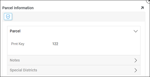
Example of Groups configured with Accordions
- Navigate to the panel where you want to configure the Group.
- Go to the Action Drawer > Live Designer.
- Locate (or add) the panel where you want to add a Group and click the corresponding Controls button.
- Click + Control to open the Add a Control wizard.
- Set the Control Type to Accordion.
- Assign a Name. For example:
Parcel. - Control Subtype determines how the accordion behaves when a set is opened. It is Single by default. Click to change it to Multiple.
- Click Next.
- Check or change the control name, then click Finish.
- Continue to create remaining Group containers. For example:
Notes, Special Districts. - Set the Parent value of any remaining Groups to the Accordion Group.
- Assign all appropriate Controls to Groups using the Parent value in the Controls panel.
- To further configure a group control, click its Open record icon.
- Navigate to the application UI view, refresh the web browser and confirm results.
How to Configure a Group with Tabs
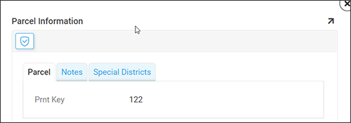
Example of Groups configured with Tabs
- Navigate to the panel where you want to configure the Group.
- Go to the Action Drawer > Live Designer.
- Locate (or add) the panel where you want to add a Group and click the corresponding Controls button.
- Click + Control.
- Set the Control Type to Tab.
- Assign a Name. For example: Parcel.
- Assign the Parent as the Panel container the Group resides in. For example: Parcel Information (SRP).
- Save and exit.
- Continue to create remaining Group containers. For example:
Notes, Special Districts. - Set the Parent value of any other Groups to the Tab Group.
- Assign all appropriate Controls to Groups using the Parent value in the Controls panel.
- Navigate to the application UI view, refresh the web browser and confirm results.