How To Hide an Up-Down Control in Numeric Field
Numeric fields display an up-down control incrementor, by default, when the field is in the edit state. A user can click the up or down buttons to increment or decrement a corresponding numeric value. There may be instances where you want to hide this up-down control, and this article will step you through how to hide it.
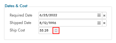
Example showing the Up-Down Control visible
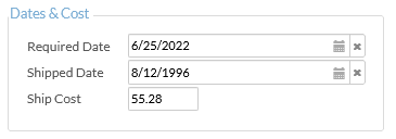
Example showing the Up-Down Control hidden
Create a Custom Theme Interface (Chrome, Safari, Edge, Opera)
- Navigate to the IDE > Additional Settings
- Click the Theme Interfaces button
- Click + Interface
-
Provide the following inputs:
- Real Estate = Controls
- Group = Fields
- Collection = Customer
- Name = Up-Down Control
- Selector =
input::-webkit-outer-spin-button, input::-webkit-inner-spin-button
-
Click the checkmark icon to save
Create a Custom Theme Interface (Firefox)
- Navigate to the IDE > Additional Settings
- Click the Theme Interfaces button
- Click + Interface
-
Provide the following inputs:
- Real Estate = Controls
- Group = Fields
- Collectione = Customer
- Name = Up-Down Control (Firefox)
- Selector =
input[type=number]
-
Click the checkmark icon to save
Option 1: Apply the Custom Theme Sitewide
Follow these steps if you want to apply this customization across an entire app.
- Navigate to the IDE > Look and Feel
- Select the Collection assigned to your app
- Go to the Base Theme
- Select Controls under Components
- Select Fields under Subcomponents
- Click the + Style button
-
Provide the following inputs:
- Area = Up-Down Control
- Style Type = Display
- 1-Display =
; -webkit-appearance: none; margin: 0 - 2-Opacity =
0
-
Click Save
- Click the + Style button
-
Provide the following inputs:
- Area = Up-Down Control (Firefox)
- Style Type = Display
- 1-Display =
;-moz-appearance: textfield
-
Click Save
Option 2: Apply the Custom Theme to a Specific Control
Follow these steps if you want to apply this customization at a granular level, for example to a specific control.
- Navigate to the IDE > Look and Feel
- Select the Customer Collection
- Click the + Theme button
- Assign a Theme Name. For example: Hide Up-Down Control
- Set the Type to Field
- Click Save
- Select Controls under Components
- Select Fields under Subcomponents
- Click the + Style button
-
Provide the following inputs:
- Area = Up-Down Control
- Style Type = Display
- 1-Display =
; -webkit-appearance: none; margin: 0 - 2-Opacity =
0
-
Click Save
- Click the + Style button
-
Provide the following inputs:
- Area = Up-Down Control (Firefox)
- Style Type = Display
- 1-Display =
;-moz-appearance: textfield
-
Click Save
Apply Theme to a Control
- Navigate to the page with the control to modify
- Go to Action Drawer > Live Designer
- Select the control from the page design view
- Go to More > Styles
- Click + Conditional Formatting
- Select Unconditional
- Click the Choose Style button
- Locate the custom theme. For example: Hide Up-Down Control
- Click the + Choose button
- Navigate back to the app view, refresh the browser and test update